→ KANZ website, 2024
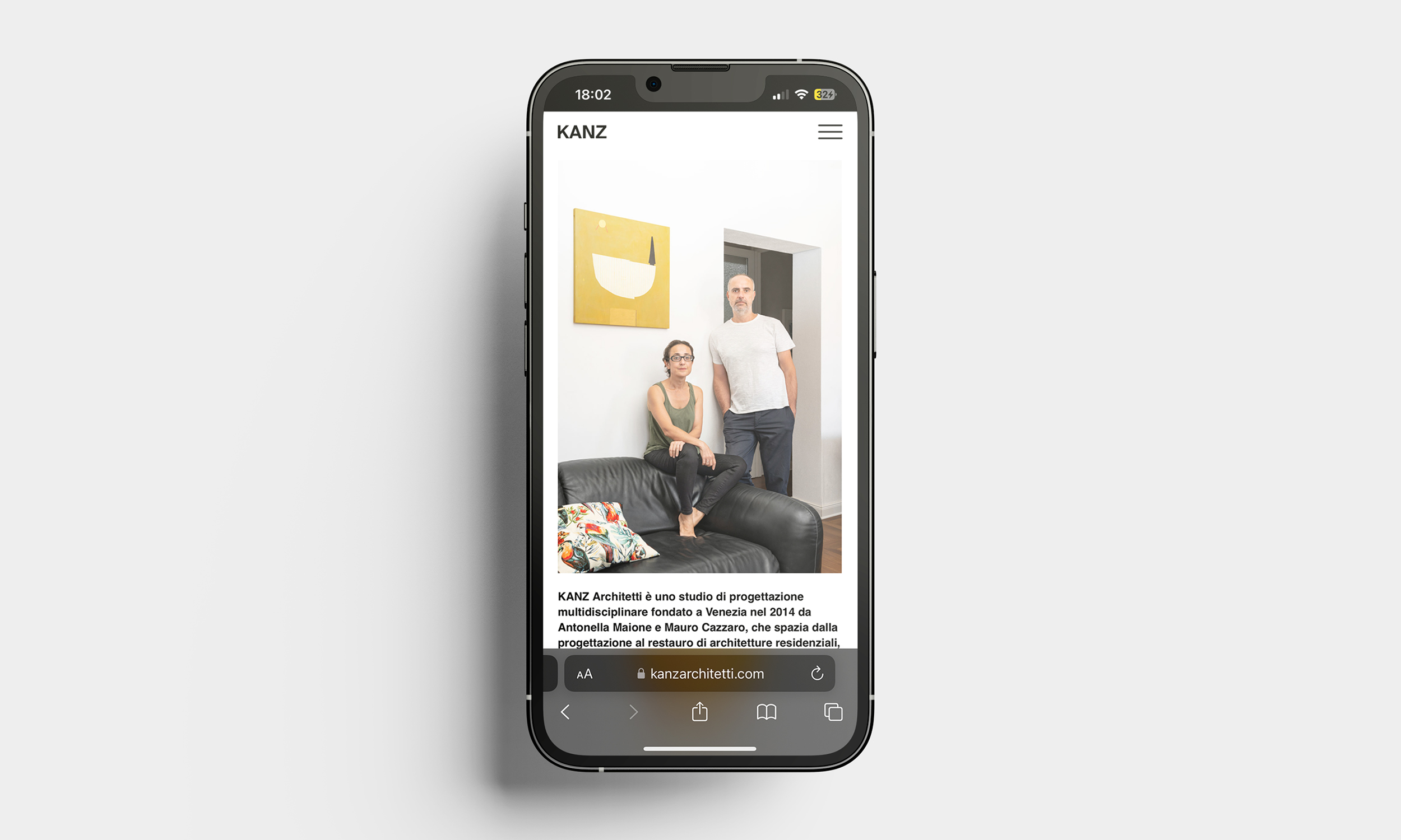
A comprehensive website redesign was undertaken for the product and architecture design studio KANZ Architetti in Venice, known for its collaboration with local artisans.
The studio required a digital presence that mirrored its aesthetic values while showcasing its products and projects.
One of the primary goals of the project was to create a more visually ordered and content-organized website. This involved reducing the excess information and decluttering the interface, allowing for a cleaner and more streamlined user experience. By eliminating unnecessary elements and focusing on essential content, the redesigned website now presents information in a more coherent and accessible manner, enhancing the overall navigability and user engagement.
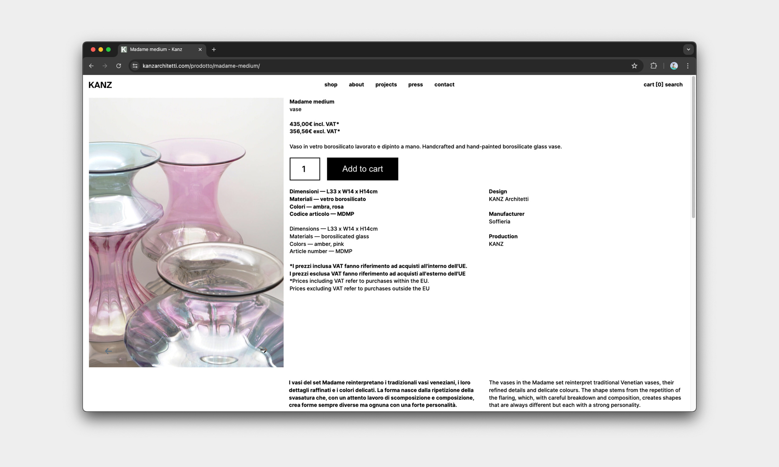
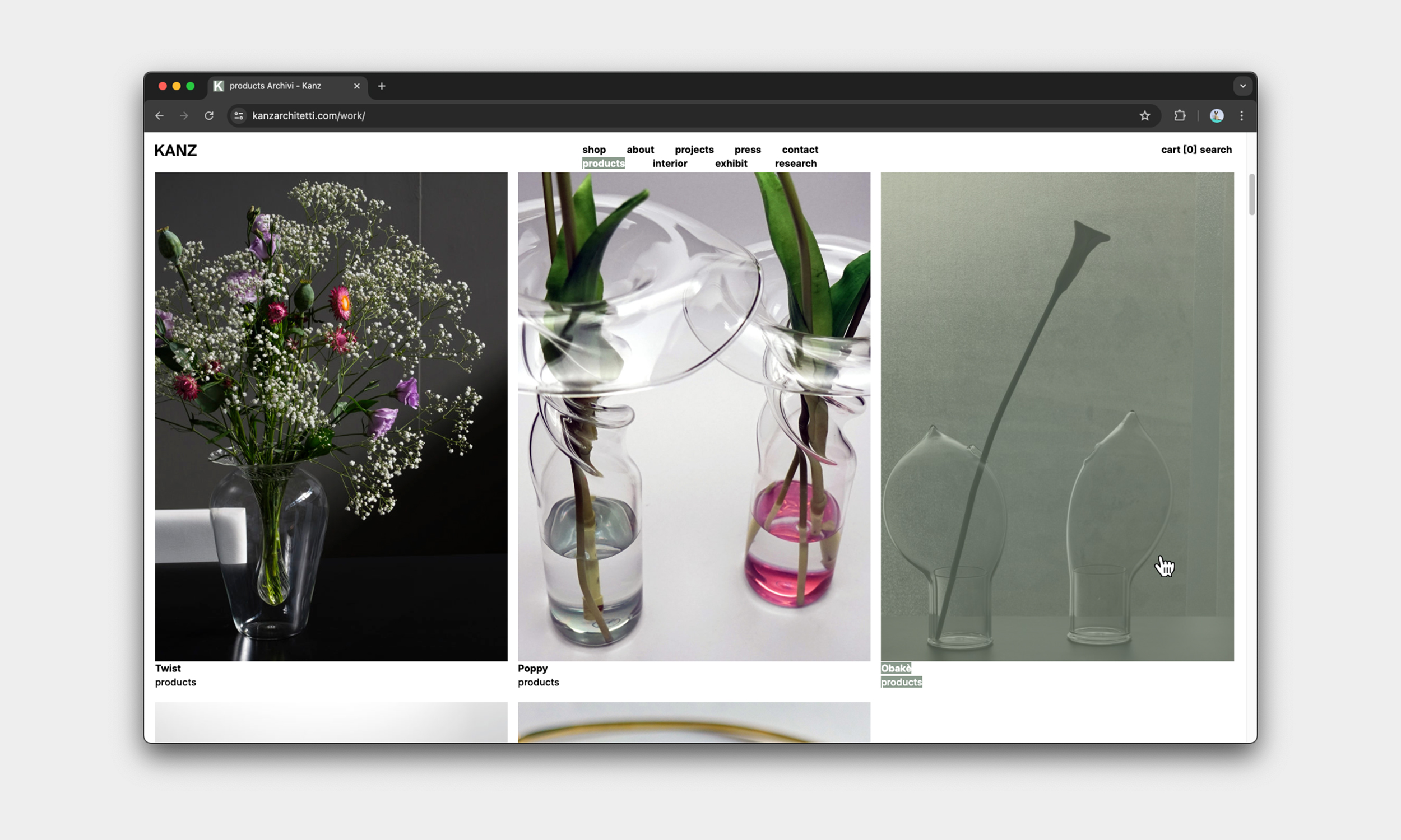
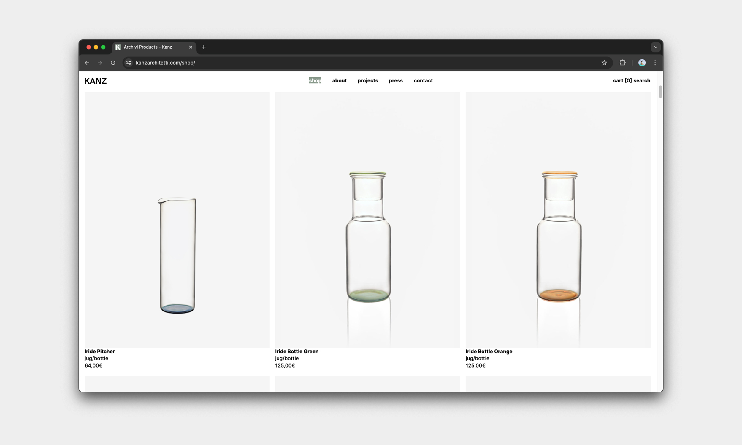
The redesigned website is based on a 3-column grid layout, providing a structured and visually appealing presentation of the studio’s portfolio and product range.
This grid system enhances navigability, allowing users to seamlessly browse through various projects, services, and glass objects. A new hover effect was introduced, where text is highlighted with an animation, adding a dynamic and interactive element to the user experience.
To maintain a cohesive and refined aesthetic, the usage of the studio’s signature color was strategically reduced to give it more importance.
The website is available at:
https://www.kanzarchitetti.com/
A comprehensive website redesign was undertaken for the product and architecture design studio KANZ Architetti in Venice, known for its collaboration with local artisans.
The studio required a digital presence that mirrored its aesthetic values while showcasing its products and projects.
One of the primary goals of the project was to create a more visually ordered and content-organized website. This involved reducing the excess information and decluttering the interface, allowing for a cleaner and more streamlined user experience. By eliminating unnecessary elements and focusing on essential content, the redesigned website now presents information in a more coherent and accessible manner, enhancing the overall navigability and user engagement.
The redesigned website is based on a 3-column grid layout, providing a structured and visually appealing presentation of the studio’s portfolio and product range.
This grid system enhances navigability, allowing users to seamlessly browse through various projects, services, and glass objects. A new hover effect was introduced, where text is highlighted with an animation, adding a dynamic and interactive element to the user experience.
To maintain a cohesive and refined aesthetic, the usage of the studio’s signature color was strategically reduced to give it more importance.
The website is available at:
https://www.kanzarchitetti.com/